Run chart
Run Chart[edit]
A run chart is a graphical tool used in quality control and process improvement to analyze and monitor data over time. It is a simple and effective way to visualize trends, patterns, and shifts in data, allowing organizations to make data-driven decisions and identify areas for improvement.
Purpose[edit]
The primary purpose of a run chart is to display data in a time-ordered sequence. It helps to identify any unusual patterns or trends that may be occurring in a process. By plotting data points on a graph, a run chart provides a visual representation of how a process is performing over time.
Construction[edit]
To construct a run chart, the following steps are typically followed:
1. Collect Data: Gather the relevant data points that need to be analyzed. This could include measurements, counts, or any other numerical data.
2. Determine Time Period: Decide on the time period over which the data will be plotted. This could be days, weeks, months, or any other suitable time frame.
3. Plot Data Points: Plot the collected data points on the y-axis of the chart, with time intervals on the x-axis. Each data point represents a measurement or observation taken at a specific time.
4. Connect Data Points: Connect the data points with a line to show the progression of the data over time. This line helps to visualize any trends or patterns that may exist.
Interpretation[edit]
Interpreting a run chart involves analyzing the patterns and trends displayed on the graph. Some key points to consider during interpretation include:
1. Shifts: Look for any sudden shifts or changes in the data. These could indicate a change in the process or an external factor affecting the data.
2. Trends: Identify any consistent upward or downward trends in the data. This could indicate a gradual improvement or deterioration in the process.
3. Outliers: Pay attention to any data points that fall significantly outside the normal range. These outliers may indicate special causes or unusual events that need further investigation.
4. Cycle Time: Analyze the time between consecutive data points. If the cycle time is consistent, it suggests a stable process. However, if the cycle time varies significantly, it may indicate process instability.
Benefits[edit]
Using run charts in quality control and process improvement offers several benefits:
1. Visual Representation: Run charts provide a clear and concise visual representation of data, making it easier to identify patterns and trends.
2. Real-Time Monitoring: By updating the run chart regularly, organizations can monitor process performance in real-time and take immediate action if necessary.
3. Data-Driven Decision Making: Run charts enable data-driven decision making by providing objective evidence of process performance and improvement opportunities.
4. Easy to Create and Understand: Run charts are simple to create and understand, making them accessible to individuals at all levels of an organization.
Limitations[edit]
While run charts are a valuable tool, they do have some limitations:
1. Lack of Context: Run charts only display data points and trends, without providing the underlying context or reasons behind the observed patterns.
2. Limited Statistical Analysis: Run charts do not provide detailed statistical analysis of the data. For more in-depth analysis, additional statistical tools may be required.
3. Subjectivity in Interpretation: Interpreting run charts can be subjective, as different individuals may interpret the same data differently.
Conclusion[edit]
In conclusion, a run chart is a powerful tool for analyzing and monitoring data over time. It helps organizations identify trends, patterns, and shifts in data, enabling them to make data-driven decisions and improve processes. By understanding the construction, interpretation, benefits, and limitations of run charts, organizations can effectively utilize this tool to drive continuous improvement and achieve their quality goals.

Run chart gallery[edit]
-
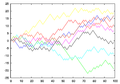
 Simple Run Chart
 -
 Random Walk Example


Ad. Transform your health with W8MD Weight Loss, Sleep & MedSpa

Tired of being overweight?
Special offer:
Budget GLP-1 weight loss medications
- Semaglutide starting from $29.99/week and up with insurance for visit of $59.99 and up per week self pay.
- Tirzepatide starting from $45.00/week and up (dose dependent) or $69.99/week and up self pay
✔ Same-week appointments, evenings & weekends
Learn more:
- GLP-1 weight loss clinic NYC
- W8MD's NYC medical weight loss
- W8MD Philadelphia GLP-1 shots
- Philadelphia GLP-1 injections
- Affordable GLP-1 shots NYC
|
WikiMD Medical Encyclopedia |
Medical Disclaimer: WikiMD is for informational purposes only and is not a substitute for professional medical advice. Content may be inaccurate or outdated and should not be used for diagnosis or treatment. Always consult your healthcare provider for medical decisions. Verify information with trusted sources such as CDC.gov and NIH.gov. By using this site, you agree that WikiMD is not liable for any outcomes related to its content. See full disclaimer.
Credits:Most images are courtesy of Wikimedia commons, and templates, categories Wikipedia, licensed under CC BY SA or similar.
Translate this page: - East Asian
中文,
日本,
한국어,
South Asian
हिन्दी,
தமிழ்,
తెలుగు,
Urdu,
ಕನ್ನಡ,
Southeast Asian
Indonesian,
Vietnamese,
Thai,
မြန်မာဘာသာ,
বাংলা
European
español,
Deutsch,
français,
Greek,
português do Brasil,
polski,
română,
русский,
Nederlands,
norsk,
svenska,
suomi,
Italian
Middle Eastern & African
عربى,
Turkish,
Persian,
Hebrew,
Afrikaans,
isiZulu,
Kiswahili,
Other
Bulgarian,
Hungarian,
Czech,
Swedish,
മലയാളം,
मराठी,
ਪੰਜਾਬੀ,
ગુજરાતી,
Portuguese,
Ukrainian
