Scatter plot
Scatter plot
A scatter plot (also known as a scatterplot, scatter graph, scatter chart, or scatter diagram) is a type of data visualization that uses Cartesian coordinates to display values for typically two variables for a set of data. The data is displayed as a collection of points, each having the value of one variable determining the position on the horizontal axis and the value of the other variable determining the position on the vertical axis.
Overview
Scatter plots are used to observe and show relationships between two numeric variables. The data in a scatter plot are considered to express a trend, correlation, or pattern. If the points are color-coded, an additional variable can be displayed. The scatter plot can also be used to identify other patterns in data, including clusters, outliers, and gaps.
History
The scatter plot was invented in the early 19th century by Sir John F.W. Herschel and Sir Francis Galton. Galton used the scatter plot to study the relationship between two variables and introduced the concept of correlation.
Types of Scatter Plots
- Simple Scatter Plot: Displays values for two variables for a set of data.
- Grouped Scatter Plot: Similar to a simple scatter plot but with data points color-coded to represent a third variable.
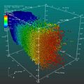
- 3D Scatter Plot: Used to display three-dimensional data; the color and size of the points can represent additional variables.
Uses of Scatter Plots
- Correlation Analysis: To determine if there is a relationship between two variables and the strength of the relationship.
- Outlier Detection: To identify data points that significantly differ from the rest of the data.
- Data Clustering: To observe the grouping of data points in the dataset.
Constructing a Scatter Plot
To construct a scatter plot, one variable is plotted along the x-axis, and the other variable is plotted along the y-axis. Each point represents an observation. The position of a point depends on its values along the two axes.
Interpretation
The pattern of the scatter plot can indicate the relationship between the variables:
- A linear pattern suggests a linear relationship.
- A curved pattern suggests a non-linear relationship.
- No pattern suggests no correlation.
Limitations
While scatter plots are useful for identifying trends and patterns, they have limitations:
- They are less effective for large datasets where points can overlap, making it difficult to identify patterns.
- They do not provide a clear way to quantify the relationship between variables.
See Also

This article is a graph theory-related stub. You can help WikiMD by expanding it!
Scatter plot gallery
-
 Scatter diagram for quality characteristic XXX
 -
 Old Faithful 3
 -
 Scatter plot
 -
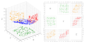 Matriz de gráficos de dispersão


Ad. Transform your life with W8MD's
GLP-1 weight loss injections special from $29.99 with insurance
|
WikiMD Medical Encyclopedia |
Medical Disclaimer: WikiMD is for informational purposes only and is not a substitute for professional medical advice. Content may be inaccurate or outdated and should not be used for diagnosis or treatment. Always consult your healthcare provider for medical decisions. Verify information with trusted sources such as CDC.gov and NIH.gov. By using this site, you agree that WikiMD is not liable for any outcomes related to its content. See full disclaimer.
Credits:Most images are courtesy of Wikimedia commons, and templates, categories Wikipedia, licensed under CC BY SA or similar.
Translate this page: - East Asian
中文,
日本,
한국어,
South Asian
हिन्दी,
தமிழ்,
తెలుగు,
Urdu,
ಕನ್ನಡ,
Southeast Asian
Indonesian,
Vietnamese,
Thai,
မြန်မာဘာသာ,
বাংলা
European
español,
Deutsch,
français,
Greek,
português do Brasil,
polski,
română,
русский,
Nederlands,
norsk,
svenska,
suomi,
Italian
Middle Eastern & African
عربى,
Turkish,
Persian,
Hebrew,
Afrikaans,
isiZulu,
Kiswahili,
Other
Bulgarian,
Hungarian,
Czech,
Swedish,
മലയാളം,
मराठी,
ਪੰਜਾਬੀ,
ગુજરાતી,
Portuguese,
Ukrainian
